You’ve probably seen it on websites where logos, testimonials, or product images continuously glide across the screen without stopping. It’s smooth, lightweight, and visually engaging — and the best part? You can build it without a single line of JavaScript.
In this blog, I will teach you how to create a horizontal infinite scroll animation using only HTML and CSS. This is a very good project to learn CSS and apply real world knowledge. By the end of this blog you will understand how this works and you can customize it as per your need.
Content Table
- Why Use a Horizontal Infinite Scroll?
- Step 1: Setting Up the HTML Structure
- Step 2: Styling and Animating with CSS
- Step 3: Adding a Pause-on-Hover Effect
- Step 4: Making It Responsive
- Step 5: Adding a Gradient Animation (Optional)
- Step 6: Automate Duplication with JavaScript (Optional)
- Step 7: Adjusting Speed Dynamically
- Common Use Cases
- Troubleshooting Tips
- Responsive Behavior & Testing
- Real-World Example
- SEO & Performance Benefits
- What You Learned
- Final Thoughts
Why Use a Horizontal Infinite Scroll?
Before we start coding, it’s helpful to understand why you might want this effect in the first place. Animation is not just decoration; it’s part of user experience design. When used correctly, it can:
- Draw attention – Continuous motion naturally attracts the eye.
- Showcase multiple items – Useful for displaying client logos, tech stacks, or product highlights.
- Save space – You can present a large list in a single horizontal strip.
- Enhance brand personality – Smooth motion and gradients give a premium, modern look.
This type of scroll animation is especially common in:
- SaaS landing pages (for showing integrations or partners)
- E-commerce websites (for featured products)
- Portfolio sites (to display tools or technologies)
- Media websites (for trending topics or headlines)
Now that you know why it’s valuable, let’s get started building one from scratch.
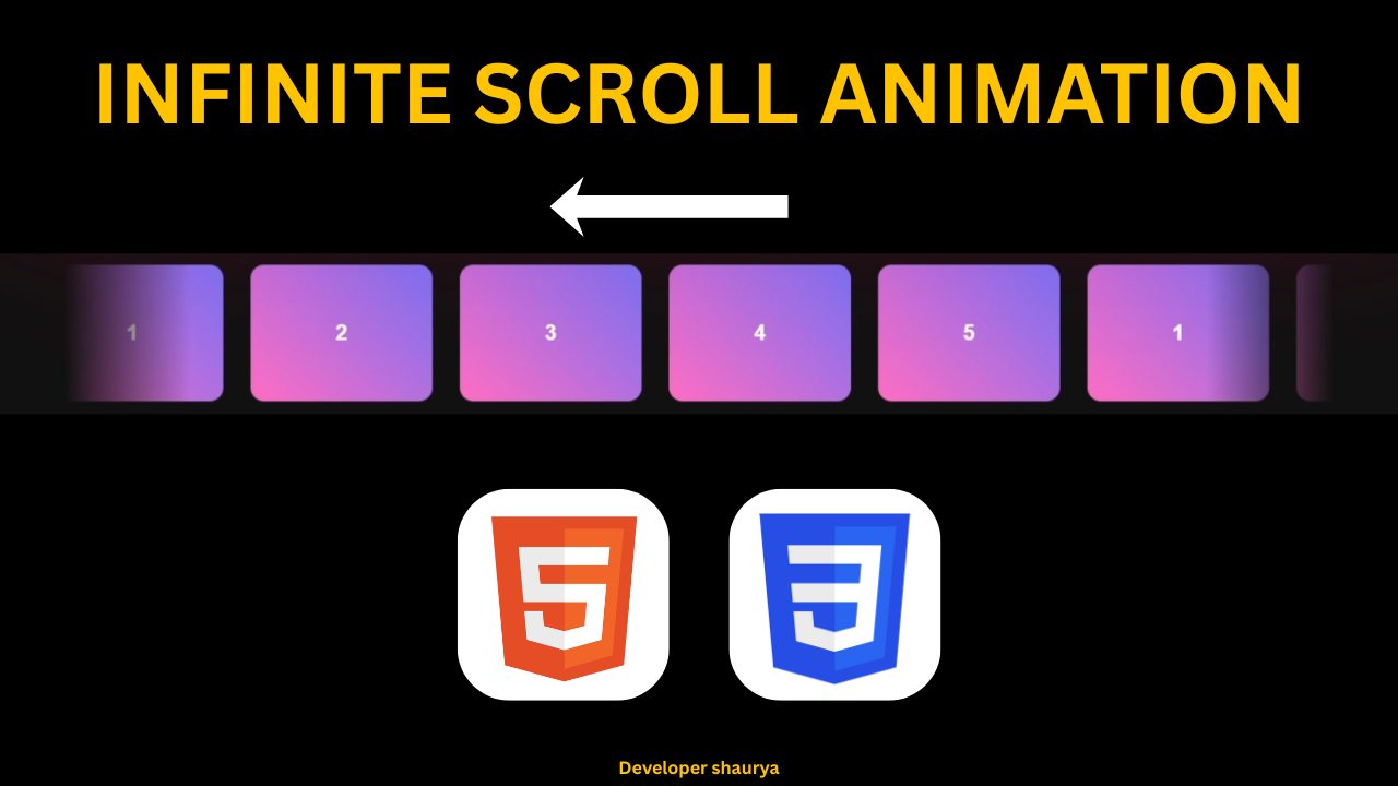
Step 1: Setting Up the HTML Structure
Every great animation starts with a simple, clean HTML structure. Our scroll effect will revolve around two key containers:
- A scroll-container that defines the visible area
- A scroll-content that moves inside it
Here’s our base structure 👇.
<!DOCTYPE html>
<html lang="en">
<head>
  <meta charset="UTF-8" />
  <meta name="viewport" content="width=device-width, initial-scale=1.0" />
  <title>Horizontal Infinite Scroll</title>
  <link rel="stylesheet" href="style.css" />
</head>
<body>
  <div class="scroll-container">
    <div class="scroll-content">
      <div class="scroll-item">1</div>
      <div class="scroll-item">2</div>
      <div class="scroll-item">3</div>
      <div class="scroll-item">4</div>
      <div class="scroll-item">5</div>

      <!-- Duplicate for infinite effect -->
      <div class="scroll-item">1</div>
      <div class="scroll-item">2</div>
      <div class="scroll-item">3</div>
      <div class="scroll-item">4</div>
      <div class="scroll-item">5</div>
    </div>
  </div>
</body>
</html>
Let’s break this down:
- The
.scroll-containeracts as the viewport. Anything outside of it will be hidden, giving us the illusion of content entering and exiting the screen. - The
.scroll-contentcontains all the scrolling items. - Each
.scroll-itemis a card or block that represents one unit of content. - We duplicate all items once so the animation can loop seamlessly. When one set scrolls out of view, the next set is already entering.
This simple structure is all we need for the HTML part. Now, let’s add style and movement!
Step 2: Styling and Animating with CSS
Open your style.css file and add the following code. We’ll style the container, items, and define our animation.
body {
  margin: 0;
  padding: 0;
  display: flex;
  justify-content: center;
  align-items: center;
  height: 100vh;
  background: #111;
  font-family: sans-serif;
}

/* The main container */
.scroll-container {
  position: relative;
  width: 80%;
  overflow: hidden;

  /* Gradient mask for fading edges */
  mask-image: linear-gradient(to right, transparent 0%, black 10%, black 90%, transparent 100%);
  -webkit-mask-image: linear-gradient(to right, transparent 0%, black 10%, black 90%, transparent 100%);
}

/* Scrolling content */
.scroll-content {
  display: flex;
  gap: 30px;
  animation: scroll 10s linear infinite;
}

/* Pause animation when hovered */
.scroll-container:hover .scroll-content {
  animation-play-state: paused;
}

/* Individual scroll items */
.scroll-item {
  flex: 0 0 auto;
  width: 200px;
  height: 150px;
  background: linear-gradient(45deg, #ff6ec4, #7873f5);
  border-radius: 15px;
  display: flex;
  justify-content: center;
  align-items: center;
  color: #fff;
  font-size: 1.5rem;
  font-weight: bold;
}

/* Keyframes for the infinite scroll */
@keyframes scroll {
  0% {
    transform: translateX(0);
  }
  100% {
    transform: translateX(-50%);
  }
}
How It Works
Let’s walk through the important parts:
display: flex;on.scroll-contentarranges the items horizontally.- The
animation: scroll 10s linear infinite;applies our keyframes that move the content leftward. transform: translateX(-50%)ensures the animation shifts by exactly half of the total width, aligning perfectly with our duplicated content.- The
mask-imagegradient hides the edges gradually, making the items appear and disappear smoothly. - Hovering over the container pauses the animation — a nice interactive touch!
Step 3: Adding a Pause-on-Hover Effect
User interaction matters. By adding:
.scroll-container:hover .scroll-content {
  animation-play-state: paused;
}
you give users control. They can hover to pause and inspect an item. This is especially useful if your scroll items contain logos, offers, or product previews that users might want to examine.
Step 4: Making It Responsive
In a real-world project, users visit your site from screens of all sizes. We can use CSS functions like clamp() to make sure your scroll items scale dynamically.
Replace your .scroll-item sizing with:
.scroll-item {
  width: clamp(120px, 15vw, 200px);
  height: clamp(100px, 12vw, 150px);
  font-size: clamp(1rem, 2vw, 1.5rem);
}
This ensures your cards remain proportionate whether on a large monitor or small mobile screen.
Step 5: Adding a Gradient Animation (Optional)
Want each item to have a subtle movement inside it? You can animate the gradient background:
.scroll-item {
  background: linear-gradient(45deg, #ff6ec4, #7873f5);
  background-size: 200% 200%;
  animation: gradientMove 4s ease infinite alternate;
}

@keyframes gradientMove {
  0% { background-position: 0% 50%; }
  100% { background-position: 100% 50%; }
}
This adds life inside each item — making your scroll look even more premium.
Step 6: Automate Duplication with JavaScript (Optional)
Manually duplicating items is fine for small sets, but if your list is dynamic, you can automate it:
<script>
  const scrollContent = document.querySelector('.scroll-content');
  scrollContent.innerHTML += scrollContent.innerHTML; // duplicate all items
</script>
This snippet copies all existing items automatically, saving you from repetition in HTML.
Step 7: Adjusting Speed Dynamically
Different websites may require different animation speeds. Instead of hardcoding it, use CSS variables:
.scroll-content {
  --speed: 12s;
  animation: scroll var(--speed) linear infinite;
}
Now you can easily tweak speed by just changing the --speed variable — or even modify it with JavaScript based on user settings.
Common Use Cases
This type of infinite scroll animation can be used in many creative ways:
- Client Logo Carousel
Display your partners or sponsors smoothly across the screen. - Technology Stack Slider
Showcase the frameworks, tools, or languages you use. - Product Highlights
Scroll through product cards or offers. - Testimonials Strip
Highlight customer feedback continuously. - News Headlines
Create a modern ticker that loops through trending topics.
Troubleshooting Tips
If your scroll isn’t looping smoothly, check these common issues:
- Forgot to duplicate items – You must duplicate the set for a seamless loop.
- Wrong translateX value – Ensure you move
-50%if you’ve duplicated once. - Animation timing – A
lineareasing keeps motion consistent. - Container overflow – Make sure
overflow: hiddenis set on.scroll-container.
Responsive Behavior & Testing
Once implemented, always test on multiple devices:
- Desktop: Check alignment and spacing.
- Tablet: Ensure gap scaling works.
- Mobile: Verify touch responsiveness and font scaling.
You can adjust gap, speed, or item width as needed to fit your layout.
Real-World Example
Imagine you’re building a portfolio website. You want to showcase the technologies you work with:
<div class="scroll-container">
  <div class="scroll-content">
    <div class="scroll-item">HTML</div>
    <div class="scroll-item">CSS</div>
    <div class="scroll-item">JavaScript</div>
    <div class="scroll-item">PHP</div>
    <div class="scroll-item">MySQL</div>
  </div>
</div>
With the animation applied, your tech stack scrolls smoothly — an elegant way to demonstrate your skills without clutter.
SEO & Performance Benefits
- Lightweight: Pure CSS = no JS overhead.
- Accessible: Works even if JavaScript is disabled.
- SEO-Friendly: Content is still visible in HTML, not hidden behind scripts.
- Smooth UX: Linear animation feels natural and professional.
For optimal performance, keep your total content width moderate and use GPU-accelerated transforms (which transform: translateX already is).
What You Learned
In this tutorial, you learned how to:
Build a scroll container and content section
Animate content with CSS keyframes
Create a seamless infinite loop using duplication
Add gradient masks and responsive design
Pause the animation on hover
Optionally enhance it with gradient motion and JS automation
You now have a powerful UI component ready for your next project.
Final Thoughts
CSS animations can create delightful, dynamic interfaces without relying on heavy JavaScript. The horizontal infinite scroll is one of those timeless UI patterns that blend simplicity, interactivity, and beauty.
Next time you’re building a landing page, portfolio, or dashboard, try implementing this scroll effect. It adds motion, depth, and polish — all while keeping your codebase light and maintainable.
Remember: great design isn’t about complexity — it’s about clarity, rhythm, and purpose. This scrolling effect embodies all three.
So go ahead, experiment with colors, speed, and spacing — and make your web page come alive.
All CheatSheets view
Checkout other Cheatsheets
Checkout My YouTube Channel
Read my other Blogs
- Top 5 Mistakes Beginners Make While Learning to Code (And How to Avoid Them)
- Best Programming Languages to Learn in 2025 (and Why)
- Before You Learn Web Development: The Advice No One Gave Me
- How to Start Coding in 2025: Beginner’s Roadmap
- Why Coding is Important: The Language of the Future
- Are Coding and Programming the Same? – The Complete Truth You Need to Know
- Will Coding Be Replaced by AI?
- C++ Programming: Everything You Need to Know